
The Book of Durrow Opening Page to the Gospel of Saint Mark, 680 A.D., anonymous, Ireland
Gothic illuminated manuscripts could be said to have taken a step backwards in terms of legibility in text. The use of dense black textura script (lettering style with a repetition of forms, picket fence-like), elimination of rounded script, and lack of spacing made the text hard to read. On the other hand, the marginalia is very fanciful, and serves the purpose of prompting the priest to tell relevant stories as he reads the text. There is also an integration of geometric abstract form, animal form, and human form that is not found in most Celtic manuscripts. The use of decorative capital letters is obvious and continues to be a major part of illuminated manuscripts, but the use of decorative lettering and illustration declines as the printing press begins to take hold. There is a standardization of printed work that is not seen before the printing press. This is good because it increases legibility of type, but is bad because it takes some of the individuality and expression out of later works. As you can see in this page from the Douce Apocalypse, all of the problems with the type can be seen, as well as the successful work in the margins.

Page from the Ormesby Psalter, c. early 1300s A.D., anonymous, England
Once the printing press came into existence in around 1450, text was still somewhat illegible initially because of the lack of spacing, but as type evolved, it became smaller, more uniform because it was no longer handwritten, not to mention the type was not unique to the handwriting of the person writing the text. The spacing issue was also fixed, and punctuation, capital, and lowercase letters were created over time. Books became less aesthetic objects and more so a commodity, because now it could be reproduced and easily spread throughout the world, but the time and detail spent on the books was lacking because it was a new technology, and that level of detail could not be transferred to printing at the time. Once the merchant class started funding artistic endeavors, art spread all over Europe, because it was no longer funded by an elite class of wealthy people, but it was spread to general population. There were also people who helped push art throughout Europe, including Pope Julius II, who had a love for the arts and commissioned several pieces around 1490's, as well as the ceiling of the Sistine Chapel by Michelangelo. Lorenzo de Medici also played a major part in spreading art throughout Italy. He also helped make the Italian Renaissance boom along with the printing press. He funded peoples work, and told everyone he new to read the classic philosophers (thanks printing press). The combination of these things helped push people to think in a different way, or at least in a way that was more pro-human, not like in the medieval ages. Lucas Cranach the Elder also played an important role in adding to the work during the Renaissance and helped bridge the fine arts world and the graphic design world. It is also important to note that Martin Luther would never have been able to spread his 99 Theses and start the Protestant Reformation had he not lived in Germany and had there not been a printing press. People started making specific typefaces, and two men that were particularly influential in universalizing type were Arnold Pannartz and Conrad Sweynheym. A cardinal at Subiaco told them to revive a Latin-Roman writing style after having found a Carolingian medieval text which they thought was Roman. They created a new text style called Double Alphabet, in which they made upper and lower case versions of all of their letters, and by introducing this uniform type, they caused the general population to speak a more uniformly. Eventually, they moved to Rome and created a "more fully Roman alphabet that became the prototype for the Roman alphabets still in use today." During the Italian Renaissance (which took place around the same time period), type was relatively close to perfected, if not already, as well as the harmony between type and illustration on the page. As you can see in the Hypnerotomachia Poliphili, an Italian example, the type is clean, well spaced, and punctuated with capital and lower case letters. It is obviously influenced by Pannartz and Sweynheym's typefaces, but is a bit cleaner (in my opinion).

Conrad Sweynheym and Arnold Pannartz, Specimans of the First (top, 1465) and Second (bottom, 1467) typefaces in the evolution towards Roman-style typefaces, Italy.

Page from Hypernerotomachia Poliphili, Aldus Manutius, 1499 A.D., Italy.

The level of illustration in German printed books is not nearly as intricate as illuminated manuscripts before the advent of the printing press, but once Albrecht Durer came along, he raised the bar for the level of intricate detail used in an engraved illustration, as well as regular illustrations. Since he grew up in Nuremburg during the time the printing press was starting, he absorbed the culture from a very young age. He also went to Italy to learn the ideals of the Renaissance, and when he returned to Germany, he was under the impression that German art was inferior. In his later work, he "achieved mastery in the use of line as tone." The fact that he could not cross hatch for a print meant that he had to use all linear shading, and he was very good at doing so. He was able to use line to express movement or stability as well as you can see in his work, The Four Horsemen of the Apocalypse.
De Ackerman aus Bohmen, c 1463, Albrecht Pfister, Germany.

The Four Horsemen of the Apocalypse, 1498, Albrecht Durer, Germany.
It is also important to note that national traditions and styles of books change after the advent of printing. There is a general loss of color and intricate detail overall, but each country has its own style. In Germany, they used illustrations that Durer thought were "inferior", and they used gothic style type. But more notably, in France, they tried to emulate the fancy marginalia from the pre-printing press era by cutting illustrations with modular blocks and pressing them onto the margins of the page. They experimented with making print more appealing to the eye. Unfortunately, their type was relatively close to the late medieval writing from old illuminated manuscripts, as you can see on this page of Sir Thomas More's Utopia.
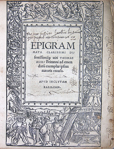
Sir Thomas More's Utopia, 1518, Johann Froben and Hans Holbein, France.